
Role
Research & UX/UI Design
Background
What is it like trying to revolutionize the event discovery space for techno music? That's the question we had to answer at the start of this project.
Initial MVP revealed significant challenges: broad, irrelevant categories, an overwhelming interface, and inconsistent event information. These issues frustrated users and hindered our growth potential. So, how do we move forward?
Challenges
Our challenges ranged from an overwhelming interface to fragmented event cards with varying layouts and excessive details. It quickly became clear that our app wasn't meeting industry benchmarks.
The biggest challenge was deciding where to start. We needed to streamline navigation, improve search functionality, and enhance the overall user experience while preparing for future features like personalized recommendations.
What I Accomplished
-
Identified key issues where users struggled to find events, often getting confused and frustrated due to inconsistent categorization and an overwhelming interface.
-
Uncovered opportunities to streamline navigation and lay the groundwork for personalized recommendations at scale.
-
Designed and implemented a new end to end event discovery app that included refactoring the navigation structure, simplifying the interface, and standardizing event card layouts, enhancing user satisfaction and setting the stage for future scalability.
Timeline
7 months
01 Research
What our users said?
The first step was understanding the current event discovery experience users were facing. I sat with our users over the course of a few days to better understand their existing journey and uncover what was working and what wasn’t. I also conducted a thorough analysis of the current system and identified usability issues.

What about business?

Key Takeaways
The Users...
Are frustrated by inconsistent categorization, an overwhelming interface, and fragmented event information, making it difficult to find and enjoy events.
The Business...
Wants a streamlined, user-friendly experience that increases user engagement, improves satisfaction, and prepares the product for future scalability and personalized recommendations.
02 Define
Defining User Mental Model
When designing, especially before starting to implement a solution, it's crucial to understand the mental models of your users. So, I created several personas to represent the various types of users and their thought processes. Here is one of the primary mental models that guided our design process
Improving User Journey
I laid out the existing user journey with our current event discovery platform and created a more desirable future state that would alleviate the primary pains user was experiencing.


What about business?

What features get us there?

03 Design
Moving fast, testing early
Lets look into details of Navigation & Filters. Part of the feedback involved users struggling with broad, irrelevant categories and the overwhelming interface. Users felt it was difficult to navigate and find events that matched their preferences. Therefore, I simplified the filter options to enhance the interface’s user-friendliness and made the navigation lighter and more intuitive.

With the filter option always visible, users didn’t realize it was an important step for refining their search results. Rather than selecting the relevant categories and then applying the filters, users were confused and frustrated with the lack of relevant event matches.
To solve this, I made it appear only after users had selected a search category. This brought a new element into the flow, helping to signify to users that they needed to perform another action (i.e., apply filters). This adjustment significantly improved the search functionality and overall user experience, making it easier for users to find events that matched their preferences.

04 Testing
Putting things together
After swiftly testing new feature explorations with the team, I put the entire flow together for a more robust usability test. This involved creating an end-to-end prototype that users could interact with as if they were navigating the app to find events. I was able to observe them navigating through the flow, making observations about what was working, what wasn’t, and comments they made about things they felt were missing or parts they especially liked.

Key Takeaways
The usability tests revealed that while users found the new interface more intuitive, there is still room for improvement in the filtering options. These insights will guide our next iterations, focusing on simplifying the filter options and enhancing the 'recommended for you' section.
05 Final UI

06 Measuring Success
Metrics and Impact
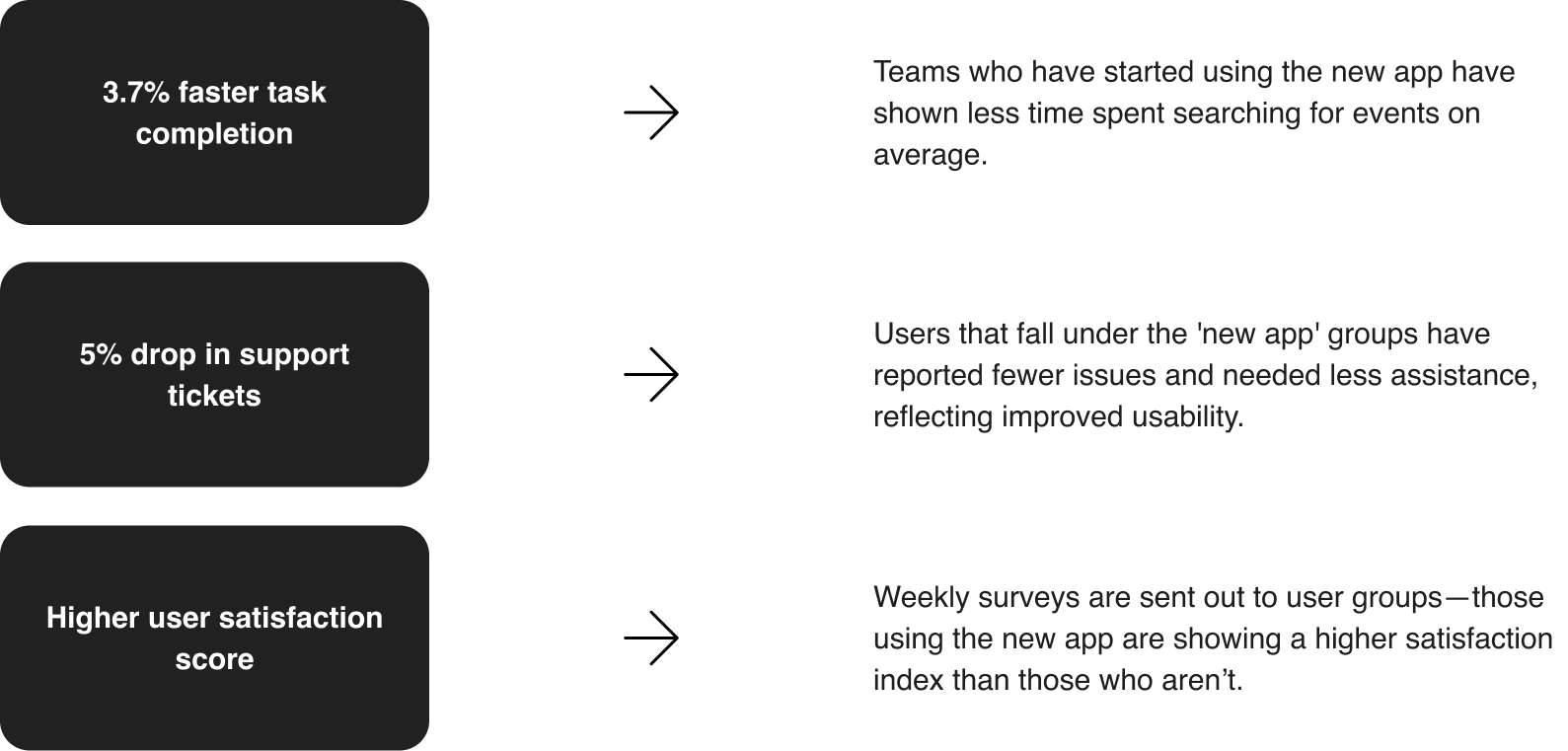
What’s UX without some metrics? This event discovery transformation was a significant project and is still ongoing. The new app was rolled out to several user groups as an initial 'test launch,' and we’re keeping close track of its performance.
While these metrics show significant improvements, achieving them required balancing user needs with technical feasibility. Integrating personalized recommendations involved selecting key user touchpoints to collect relevant event preferences, which demanded additional development time. However, this effort paid off in enhanced user experience and satisfaction. These insights will continue to guide our next steps and iterative improvements.

07 Next
Next Steps
There are still many areas to be addressed in the event discovery app for techno music enthusiasts. The initial redesign serves as a solid foundation for broader improvements that will enhance user experience and engagement.
Some next steps involve continuous monitoring of key metrics and planning additional improvements. This includes refining the event categorization, search functionality, and personalized recommendations. As we gather more user data and feedback, these insights will inform the next stages of development.
By focusing on user needs and preferences, and integrating these insights into the app, we can continue to improve the platform, ensuring it remains a valuable tool for discovering techno events and fostering a vibrant community.